1. Button
基本樣式
使用 styled 做出基本的樣式:
export const StyledButton = styled.button`
  display: flex;
  justify-content: center;
  align-items: center;

  padding: ${({ theme }) => theme.spacing(2)} ${({ theme }) => theme.spacing(4)};
  border: none;
  border-radius: 4px;
  outline: none;
  box-sizing: border-box;

  cursor: pointer;

  transition:
    color 0.2s,
    background-color 0.2s,
    border 0.2s,
    opacity 0.2s ease-in-out;

  &:hover {
    opacity: 0.9;
  }

  &:active {
    opacity: 0.7;
  }
`;
接著就可以在外層引入這個基本結構 ,
我習慣用大寫名稱的資料夾 + index.tsx 來包裝元件,
這樣做的好處是可以將 styled.ts、types.ts、文本等等都縮限在資料夾做管理:
interface ButtonProps {
  children?: React.ReactNode;
}

function Button({ children, ...props }: ButtonProps) {
  return (
    <StyledButton type="button">
      <span>{children}</span>
    </StyledButton>
  );
}
變化模式
接下來可以慢慢加入新的 props 做外觀模式的變化,
按鈕的風格預計會有 contained、outlined、text 三種,
所以個別設定出樣式後,再包裝成物件 variants,用傳入的 $variant 去索引到對應的樣式,
程式碼也會簡潔很多,省去一堆 if、短路、三元運算的判斷:
interface Props {
  $variant?: 'contained' | 'outlined' | 'text';
}

/**
 * variants
 */
const containedStyle = css`
  background-color: ${({ theme }) => theme.colors.primary};
`;

const outlinedStyle = css`
  border: 1px solid ${({ theme }) => theme.colors.primary};

  background-color: transparent;
`;

const textStyle = css`
  border: 1px solid transparent;
  border-radius: 0;

  background-color: transparent;

  &:hover {
    border-bottom: 1px solid ${({ theme }) => theme.colors.primary};
  }
`;

const variants = {
  contained: containedStyle,
  outlined: outlinedStyle,
  text: textStyle,
};

/**
 * 需要用 props 的東西時要引用泛型 Props,上面已經有定義好
 */
export const StyledButton = styled.button<Props>`
  // 省略...

  // 用 $variant
  ${({ $variant }) => variants[$variant || 'contained']}
`;
這樣大致上已經能透過傳入的屬性切換大部分的樣式了!
自訂顏色
除了 ThemeProvider 自訂的顏色關鍵字,還希望可以讓使用者傳入色碼,
因此要設計一個 custom hook 來處理顏色的判斷,
useTheme 的部分就依照先前設計好的 theme 格式去取值即可:
import { useTheme } from 'styled-components';

const checkIsColor = (color: string): boolean => {
  const regex = /(?:#|0x)(?:[a-f0-9]{3}|[a-f0-9]{6})\b|(?:rgb|hsl)a?\([^)]*\)/gi;
  return regex.test(color);
};

export const useColor = () => {
  const theme = useTheme();

  const getColor = (themeColor: string, isMuted: boolean) => {
    if (isMuted) {
      return theme.colors.text.light;
    }

    if (theme.colors) {
      return theme.colors[themeColor];
    }

    const isLegalColor = checkIsColor(themeColor);

    if (isLegalColor) {
      return themeColor;
    }

    return theme.colors.primary;
  };

  return { getColor };
};
在 Button 中使用 useColor,判斷最終要傳入什麼顏色給 StyledButton:
const { getColor } = useColor();
const btnColor = getColor(themeColor, isDisabled);

return (
  <StyledButton type="button" $variant={$variant} $themeColor={btnColor} disabled={isDisabled} {...props}>
    <span>{children}</span>
  </StyledButton>
);
這樣就可以將 styled 裡面目前固定使用的 theme.colors.primary 改為 $themeColor,
一樣要引用泛型:
const containedStyle = css<Props>`
  background: ${({ $themeColor }) => $themeColor};

  color: white;
`;
載入狀態
可以找現成的 css 動畫包成 styled 元件,要留意顏色會跟著 variant 改變:
export const LoadingAnimation = styled.div<Props>`
  width: 16px;
  height: 16px;
  border: 2px solid ${({ $variant, $themeColor }) => ($variant === 'contained' ? '#fff' : $themeColor)};
  border-bottom-color: transparent;
  border-radius: 50%;
  display: inline-block;
  box-sizing: border-box;
  animation: rotation 1s linear infinite;

  @keyframes rotation {
    0% {
      transform: rotate(0deg);
    }
    100% {
      transform: rotate(360deg);
    }
  }
`;
傳入 icon
可以加入 startIcon 與 endIcon 來接收傳入的 icon,並設計一個 styled 元件來包裝:
/**
 * icon
 */
export const Icon = styled.div<Props>`
  display: flex;
  justify-content: center;
  align-items: center;

  max-width: 24px;
  max-height: 24px;
`;
這邊稍微調整 isLoading 的邏輯,為簡化判斷與偷懶不想調樣式而改為用三元運算,
最後按鈕大致上的架構如下:
export function Button({
  children,
  variant = 'contained',
  themeColor = 'primary',
  isDisabled = false,
  isLoading = false,
  startIcon,
  endIcon,
  className,
  style,
  ...props
}: ButtonProps) {
  const { getColor } = useColor();
  const btnColor = getColor(themeColor, isDisabled || isLoading);

  return (
    <StyledButton
      $variant={variant}
      $themeColor={btnColor}
      disabled={isDisabled || isLoading}
      className={className}
      style={style}
      {...props}
    >
      {isLoading ? (
        <LoadingAnimation $variant={variant} $themeColor={btnColor} />
      ) : (
        <>
          <Icon>{startIcon}</Icon>
          <span>{children}</span>
          <Icon>{endIcon}</Icon>
        </>
      )}
    </StyledButton>
  );
}
屬性設計
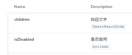
interface ButtonProps {
  /**
   * 按鈕文字
   */
  children?: React.ReactNode;

  /**
   * 按鈕樣式
   */
  variant?: 'contained' | 'outlined' | 'text';

  /**
   * 按鈕顏色
   * 可以是色碼或是主題色關鍵字
   */
  themeColor?: string;

  /**
   * 是否禁用
   */
  isDisabled?: boolean;

  /**
   * 是否讀取中
   */
  isLoading?: boolean;

  /**
   * 按鈕左側圖示
   */
  startIcon?: React.ReactNode;

  /**
   * 按鈕右側圖示
   */
  endIcon?: React.ReactNode;

  /**
   * className
   */
  className?: string;

  /**
   * inline style
   */
  style?: React.CSSProperties;

  /**
   * 點擊事件
   */
  onClick?: () => void;
}使用 jsDoc 的註解格式,可以讓 storybook 的 Docs 直接讀取變成 description:
到目前為止,不論是初期設定、custom hook 等等都設定完畢,也設計好第一個元件了! 這些設定都可以沿用下去,不過在書中的教學一開始並不會加這麼多東西提升難度, 我覺得單純練習設計元件的話甚至可以不設定 ThemeProvider 和 TypeScript。